This blog serves as the missing manual of the clustergram feature.
Introduction
Metascape visualizes enrichment results as a bar graph, a heatmap, or a network. In all cases, the unit for the visualization is a pathway/process, as this provides a concise easy-to-interpret overview of the data set. Nevertheless, users sometimes would like to dive into a gene-level visualization and clustergram is to fill that gap. Currently a clustergram is only generated during Custom Analysis. After “Enrichment Analysis”, the result is displayed as a table (Figure 1):
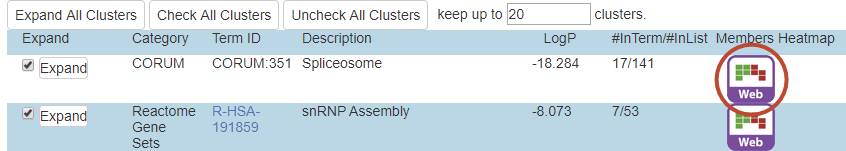
There are typically dozens or hundreds of ontology terms that are found enriched during the analysis. Metascape automatically cluster these terms into groups (or “clusters”) and we display the top 20 groups in this table. To visualize the membership of genes involved in a particular group, click on the red-circled icon to open a separate clustergram window (Figure 1). Remember each group consists of multiple GO terms, and each term consists of multiple genes, the clustergram visualize a membership matrix of genes as rows and terms as columns. It only displays terms for one selected group at a time, due to the space limitation (Figure 2).
Clustergram Components
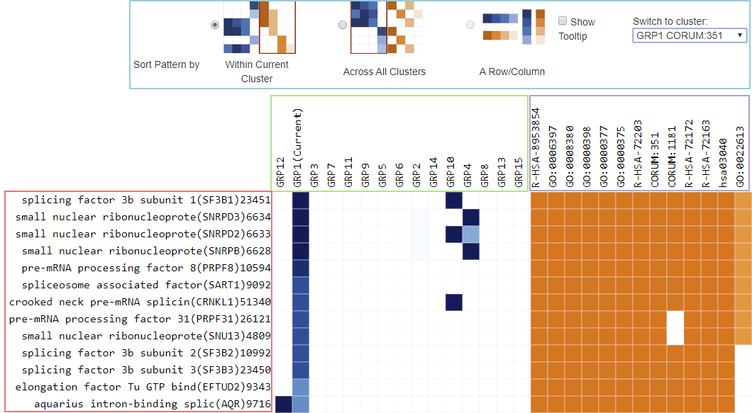
There are two matrices that are displayed.
On the left is a blue heatmap for Genes across Groups (up to 20 groups). For a given gene and a given group, the darkness of the blue tile represents the percentage of terms within the group that the gene belongs. For example, when we click to visualize the clustergram for Group 1 (the first icon in the table in Figure 1), GRP1 is activated in Figure 2 (marked as “(Current)”, the tile is nearly black for the first gene SF2B1 (score is 0.95). If GRP1 consists of 100 underlying GO terms, SF2B1 appears in about 95 terms. If the tile is rather light, say a gene only occurs in 10% of the terms in a group, the association of that gene-group is not very strong.
When you click on “Sort Pattern by Across All Clusters”, this blue matrix is reordered both row and column wise (using hierarchical clustering algorithm behind the scene), so that genes and groups of similar blue patterns are placed close to each other for the easy of visualization.
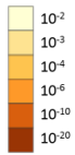
On the right is an orange heatmap for Genes across Terms (the terms within the activated Group). We view terms associated with one Group at a time; to change the Group, use the drop down list in the blue-outlined control region. The darkness of the orange color reflect the p-value of the given term. The color coding is the same as the orange colors used in enrichment bar graph or heatmap. The darker the color, the more significant the p-value is (see right).
When you click on “Sort Pattern by within Current Cluster”, the orange matrix is reordered both row and column wise for the easy of visualization.
Addition Features
You may click on a row (orange-outlined in Figure 2) to sort all tiles within the row ascendingly/descendingly (columns reorganized horizontally) by their darkness. Click on a column (green/purple-outlined) will sort the rows by the tile colors in that column. This is what “Sort Pattern by a Row/Column” mean.
If “Show Tooltip” box is checked, mouse over a tile, a gene description, a column header will show the corresponding detailed information within a popup tool tip window.